The Complete Guide to Conversion-Focused Landing Page Design
Master the art of creating landing pages that convert with proven design principles, psychology-backed strategies, and real-world examples.
The Complete Guide to Conversion-Focused Landing Page Design
A well-designed landing page can be the difference between a visitor and a customer. But creating pages that actually convert requires more than just making things look pretty—it requires understanding psychology, user behavior, and strategic design principles.
The Anatomy of a High-Converting Landing Page
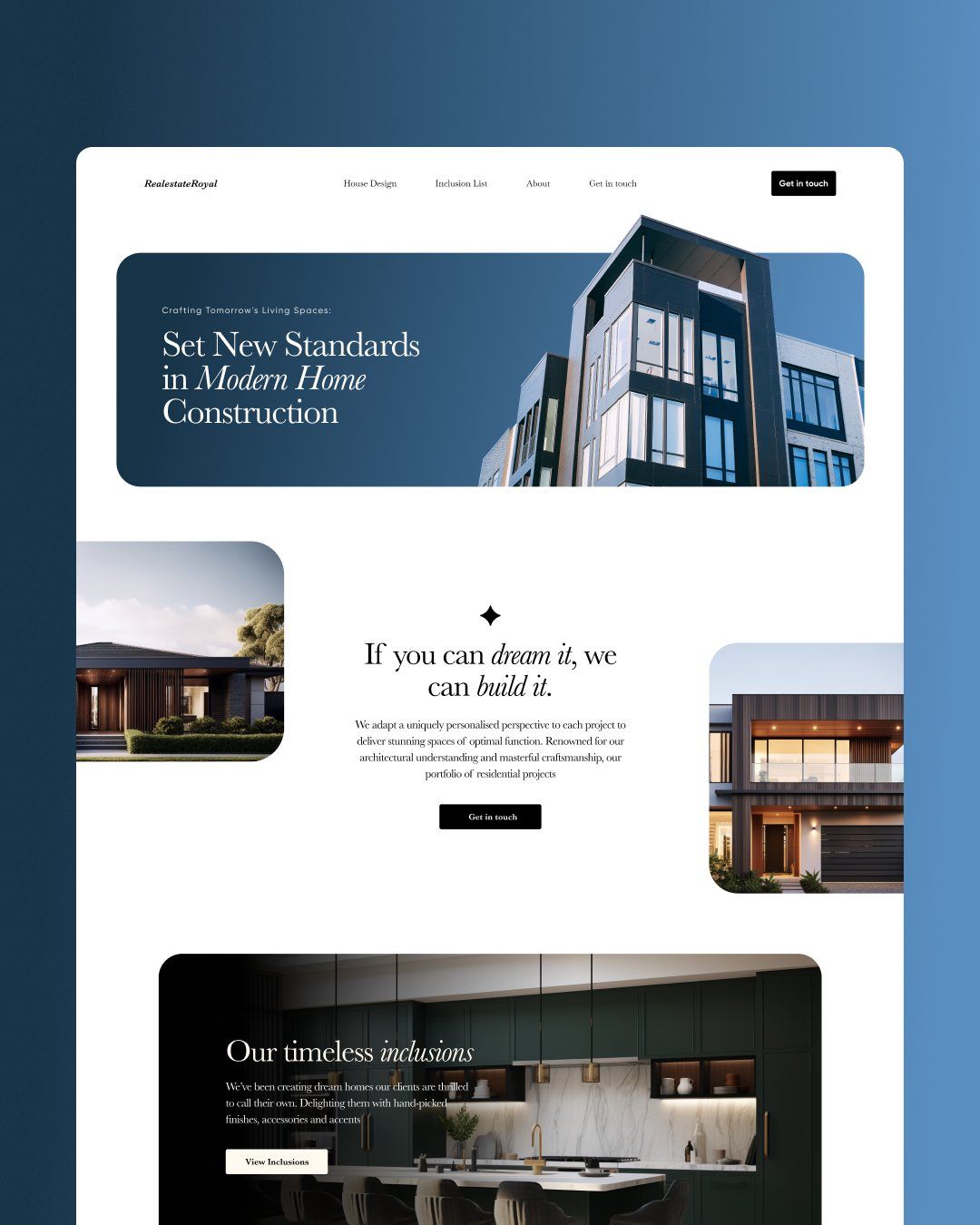
1. The Hero Section: First Impressions Matter
Your hero section has 3-5 seconds to capture attention and communicate value. Here’s what must be included:
Clear Value Proposition
- What you offer
- Who it’s for
- Why it matters
- How it’s different
Compelling Headline
- Focus on benefits, not features
- Use power words that trigger emotion
- Keep it scannable and specific
Supporting Visual
- Show your product/service in action
- Use high-quality, relevant imagery
- Ensure fast loading times
2. Social Proof: Building Trust and Credibility
Trust is the foundation of conversion. Include:
- Customer testimonials with photos and full names
- Case studies showing real results
- Trust badges and security certificates
- Client logos from recognizable companies
- Review scores from third-party platforms
3. Benefits Over Features
Don’t just list what your product does—explain what it means for your customer:
Instead of: “24/7 customer support” Say: “Get help whenever you need it, day or night”
Instead of: “Advanced analytics dashboard” Say: “See exactly which strategies are growing your business”
4. Compelling Call-to-Action (CTA)
Your CTA button is where conversions happen. Optimize it with:
- Action-oriented language (“Get Started,” “Claim Your Spot”)
- Contrasting colors that stand out from the page
- Strategic placement above and below the fold
- Urgency or scarcity when appropriate
Psychology-Backed Design Principles
The Principle of Least Resistance
Make conversion as easy as possible:
- Minimize form fields (ask only for essentials)
- Use single-column layouts for better focus
- Eliminate navigation distractions
- Provide clear next steps
Visual Hierarchy and Flow
Guide users through your page with:
- Size and contrast to highlight important elements
- White space to reduce cognitive load
- Directional cues (arrows, eye gaze) pointing to CTAs
- Progressive disclosure of information
Color Psychology in Action
Colors trigger emotional responses:
- Red: Urgency, excitement (great for limited-time offers)
- Blue: Trust, security (ideal for financial services)
- Green: Growth, money (perfect for “buy now” buttons)
- Orange: Enthusiasm, confidence (effective for creative services)
Mobile-First Conversion Optimization
With mobile traffic dominating, your landing page must excel on small screens:
Design Considerations
- Thumb-friendly button sizes (minimum 44px)
- Readable font sizes (16px minimum)
- Fast loading on slow connections
- Easy form completion with appropriate input types
Mobile-Specific Best Practices
- Use click-to-call buttons for phone numbers
- Implement auto-fill for forms
- Optimize images for retina displays
- Test on actual devices, not just browser simulators
Testing and Optimization Strategies
What to Test
- Headlines and value propositions
- CTA button text and color
- Form length and field order
- Images and videos
- Page layout and structure
Testing Methods
- A/B testing for comparing two versions
- Multivariate testing for multiple elements
- Heat mapping to see user behavior
- User session recordings for qualitative insights
Key Metrics to Track
- Conversion rate: The ultimate goal
- Bounce rate: Are people staying?
- Time on page: Are they reading?
- Form abandonment: Where do people drop off?
Common Landing Page Mistakes to Avoid
1. Too Many Options
Don’t overwhelm visitors with choices. Follow Hick’s Law: the more options you provide, the longer it takes to make a decision.
2. Weak or Missing Value Proposition
If visitors can’t immediately understand what you offer and why they should care, they’ll leave.
3. Generic, Stock Photo Imagery
Use authentic images that relate to your specific audience and offering.
4. Ignoring Page Load Speed
Even the best design won’t convert if the page doesn’t load quickly.
5. Not Optimizing for Mobile
If your landing page doesn’t work well on mobile, you’re losing the majority of your potential customers.
Measuring Success and ROI
Conversion Rate Benchmarks by Industry
- E-commerce: 2-3%
- Lead generation: 5-15%
- SaaS: 3-5%
- Professional services: 10-15%
Calculating Landing Page ROI
ROI = (Revenue from conversions - Cost of traffic) / Cost of traffic × 100Track not just immediate conversions, but lifetime customer value to understand true ROI.
Conclusion
Creating high-converting landing pages is both an art and a science. It requires understanding your audience, applying proven design principles, and continuously testing and optimizing based on real data.
Remember: the best landing page is the one that converts best for your specific audience and goals. Start with these principles, then test and iterate based on your results.
Ready to create landing pages that actually convert? Our team specializes in designing and optimizing pages that turn traffic into revenue.
Ready to Transform Your Web Presence?
Get a website that converts visitors into customers with our proven design and development strategies.
Get Started Today